
This is a technique that might be useful to our group while producing opening credits / titles for our teaser trailer.
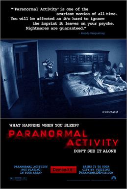
The reason why this would be a good addition is that this method is often used in conjunction with several psychological thrillers. Take Paranormal Activity (2207) as an example.
It is clear that this film aims to give the audience the impression that this film has numerous elements of tension building. The director successfully achieves this by playing on the patience of the audience watching the trailer. For example, the trailer starts outside the cinema, then the audience are seen making their way into the actual theater, then the audience prepare to watch the film, and so on. Furthermore, while the audience who are watching the film view titles and brief clips of the film, night-vision shots of the audience are used briefly in between the clips, again, playing on the patience of the viewer watching the trailer. To increase the tension, the fonts used correlate with occult subject matter, juxtaposing this with a resonant boom for the sole purpose of "waking up" the viewer.
We were intrigued by all the effects and typography used in this trailer as a result, and will certainly take this into consideration upon constructing our teaser.
We have also recognised the extent to which we can use these fonts for the website/posters/promotional material/etc. to keep the consistency of our marketing campaign in par with the psychological thriller theme.
Here examples of typography used in posters:


This is a video example of the track "Drake - Thank me now". As you can observe, the concept of constant flowing text, coupled with an easy-to-read font would be an exceptional idea to implement into our trailer, perhaps, as an experimental concept, incorporating voice-over narration.
The reason why this would be a good addition is that this method is often used in conjunction with several psychological thrillers. Take Paranormal Activity (2207) as an example.
It is clear that this film aims to give the audience the impression that this film has numerous elements of tension building. The director successfully achieves this by playing on the patience of the audience watching the trailer. For example, the trailer starts outside the cinema, then the audience are seen making their way into the actual theater, then the audience prepare to watch the film, and so on. Furthermore, while the audience who are watching the film view titles and brief clips of the film, night-vision shots of the audience are used briefly in between the clips, again, playing on the patience of the viewer watching the trailer. To increase the tension, the fonts used correlate with occult subject matter, juxtaposing this with a resonant boom for the sole purpose of "waking up" the viewer.
We were intrigued by all the effects and typography used in this trailer as a result, and will certainly take this into consideration upon constructing our teaser.
We have also recognised the extent to which we can use these fonts for the website/posters/promotional material/etc. to keep the consistency of our marketing campaign in par with the psychological thriller theme.
Here examples of typography used in posters:
Other interesting fonts can be found here http://www.designworklife.com/?p=5798


