Friday, 10 December 2010

Typography Poster

Taking into consideration the research we have taken on typography from our previous posts , one of our group members attempted to create a typography themes poster for the movie, as an extra for our ancillary task. The poster is dark themed with repeated text with a font we thought would make it look stand out and crisp. We decided to highlight certain text in red, a connotation of blood and to give a feel of the film despite the poster in general not giving much away. This is simmilar to the batman dark knight poster , a simple logo with text, gave nothing much away but left enough for the viewer to want to see more.
The image was created in photoshop CS5 , using a font from DAFONT , a royalty free font site (font called SoopaFresh). I started by making a black background , then adding a  layer of text with "Schemata" and continued to duplicate the layer and resize text appropriately.
 I continues until the image was full, however nothing stood out so we decided to add the certain aspects we wanted to amplify in red.

 Final image

After Completing this image, we decided to make an alternate version, with one of our characters "Mr Day" who is the main antagonist of the film. We decided to leave him rather ambiguous , to do this we duplicated the layer he was on in photoshop, reduced the transparency and added a lighten effect. Thus resulting in him appearing to be submerged within the background.

Alternate version :


Promotional material

It is also In our brief to create some form of promotional material to go along with our piece. We will create this using Adobe photoshop, which team member Amin has knowledge in and is willing to create a poster for. The images used for the poster will either be high resolution images taken while filming or screen captures from footage and re-edited. Our group looked at various aspects that go towards making a good film poster, we all agreed that the poster must be EYE CATCHING with writing that stands out, make the viewer QUESTION what the film is about , and keep them INTERESTED / ENGAGED and leave them with an IDEA of what the topic of the film is. We will also include links to facebook / twitter groups so viewers can be updated on the latest info. However it must be kept simple and not overload the user with information.

1. This movie poster is of The ugly truth, this perfectly shows us how a poster gives off an idea of what the film is about without knowing much about it at all. It's simplicity gives emphasis on the films core idea about how the genders think. It also references the movies site , which will give users much more information on the film.


2. This poster is for the film "devil" as you can see off the bat the upside down cross, which is a symbol of a bad omen/ antichrist or even the devil. The top line of texts gives a simplified overview of the plot, and the line insinuates one of the five people is in fact the devil. This one line itself makes people interested in how the plot will unravel , with this in mind I think our movie would benefit from having a tagline implemented in the poster. The word "Devil" is placed under the cross, not too large but viewable. This is again a rather simple poster ,but conveys a message.


3. This is a film poster for "Dispicable me" again it shows simplicity, use of text as a main feature. Seems to be simplicity is the key for success in movie posters. However this is only pre-inspiration and we will analyse further various movie posters which relate to our specific genre.

Wednesday, 8 December 2010

Mock-up Posters

The mock-up posters which were produced on Photoshop CS5 using renders from the video clips taken from our scenes. These were made by taking stills from the clips and using the pen / brush tools to remove the characters, then placed onto a black background with the pixel length & width of a traditional film poster. We then included the titles of film in a grunge/distorted look, which would exemplify the genre of the film. Through observation movie posters generally included a tagline which represents the film without giving too much away. However these are rough - drafts and ofcourse more research must go into the conventions of movie poster narratives for a high-quality production, details on research and new posters will be uploaded once completed.

Tuesday, 7 December 2010

Second task - Poster

After completing the trailer, and recieving acceptable feedback and personally being satisfied with it, we set out to complete the second product; the poster. Like with the trailer, we will set out reserching into sucessful posters and see what techniques are employed to make them successful. We also hope to keep the theme of the poster similar to the trailer to keep a visible link between them.

We decided that the poster will be created on Photoshop CS5, however first we started looking at posters from blockbuster movies for influence such as; The last House on the Left, Inception and Triangle we also looked at our poster from our AS media studies project. This year we are aiming for a cleaner look on the poster to give it a more professional look on it

Thursday, 11 November 2010

Group Re-evaluation


Our teacher has given us a talk on how our website was being created too slowly, time dedication in A-levels is a big issue, and we have not been giving our project, or the blog enough time to enhance. We have now taken initiative and will perform our tasks to an excellence. A complete re-evaluation of the website has been in progress. As well as our teaser - trailer.
In the post after this we will give an update on the layout of the website , which you will see to be a big difference to our initial hand drawn - designs and the preliminary website design.

Wednesday, 3 November 2010

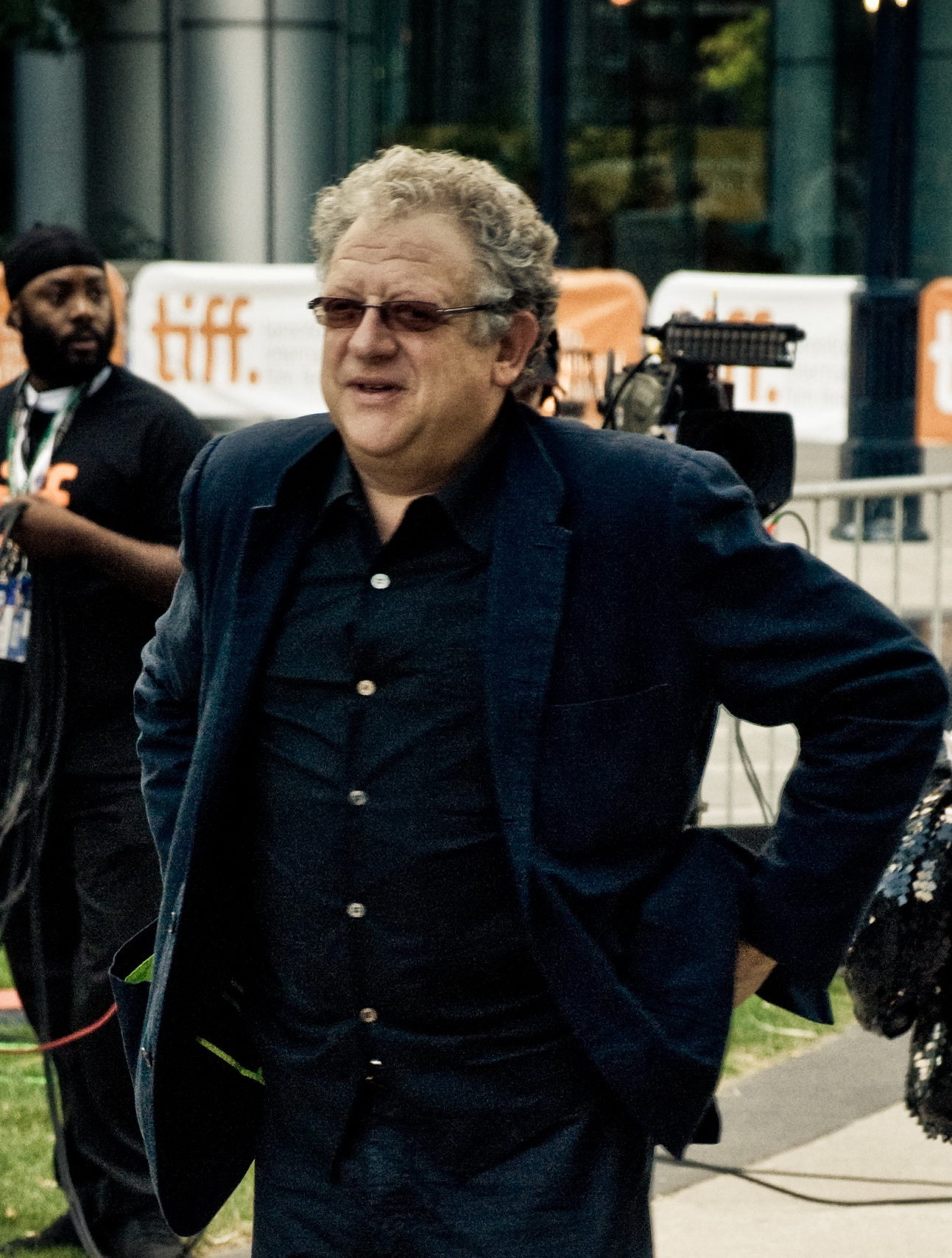
Jeremy Thomas?!!

File:Jeremy Thomas TIFF09-portrait.jpg

Our A2 were given a great opportunity to broaden our horizons in terms of learning about film productions from an industry professional. We given the opportunity to talk to Jeremy Thomas first hand in a after school Q&A session. An award winning film producer, who has handled blockbuster films with million dollar budgets is a very successful British film producer and founder of the Recorded Picture Company. He was the producer of Bernardo Bertolucci's The Last Emperor, which won the 1988 Academy Award for Best Picture and in 2006 he received a European Film Award for Outstanding European Achievement in World Cinema.

Aside from our main project, which this obviously has benefited, this chance gave us an insight into industry profession giving us a feel for what to expect in-case we wished to pursue a career in media or for our own personal side projects.
In preparation for this meeting, we had organised a film viewing after school of one of his award  film "The Last Emperor". Watching this will enabled us to see and appreciate the kind of standard and work Jeremy Thomas does and served as inspiration for some of the questions for us to ask him bearing in mind that the time we had with him was limited. Below are a few questions that we asked during the brief Q&A session;

Q1 -"How did you make your first break into the main film industry?"
Q2 -"What makes a successful production?"
Q3 -"Did it take a lot of patience to get the right shots?"
Q4 -"What tips would you give to an aspiring film producer?"

After meeting Jeremy Thomas at the Q&A sessions and showing him our current main text and ancillary texts, we left with some professional advise and tips on how to improve our current medias in order to achieve the a higher grade and deliver a beeter quality of work. From Jeremy Thomas and another group evaluation/overview we decided to improve on the website as well as taking more time into the overall presentation and trying to make it look more professional; this meant improving on the [ in terms of the shots being used, the tempo within the trailer and the 

Wednesday, 27 October 2010

Typography

This is a technique that might be useful to our group while producing opening credits / titles for our teaser trailer.
This is a video example of the track "Drake - Thank me now". As you can observe, the concept of constant flowing text, coupled with an easy-to-read font would be an exceptional idea to implement into our trailer, perhaps, as an experimental concept, incorporating voice-over narration.


The reason why this would be a good addition is that this method is often used in conjunction with several psychological thrillers. Take Paranormal Activity (2207) as an example.


It is clear that this film aims to give the audience the impression that this film has numerous elements of tension building. The director successfully achieves this by playing on the patience of the audience watching the trailer. For example, the trailer starts outside the cinema, then the audience are seen making their way into the actual theater, then the audience prepare to watch the film, and so on. Furthermore, while the audience who are watching the film view titles and brief clips of the film, night-vision shots of the audience are used briefly in between the clips, again, playing on the patience of the viewer watching the trailer. To increase the tension, the fonts used correlate with occult subject matter, juxtaposing this with a resonant boom for the sole purpose of "waking up" the viewer.

We were intrigued by all the effects and typography used in this trailer as a result, and will certainly take this into consideration upon constructing our teaser.

We have also recognised the extent to which we can use these fonts for the website/posters/promotional material/etc. to keep the consistency of our marketing campaign in par with the psychological thriller theme.

Here examples of typography used in posters:


Other interesting fonts can be found here http://www.designworklife.com/?p=5798

Tuesday, 19 October 2010

New trailer directions

The group came to a discussion of the general direction of the new teaser trailer following the failure of the 1st trailer. We therefore decided to look for more ways to advertise our product in an ambiguous fashion we began looking for other ways to introduce the film and the characters without really giving away too much of the main story's information, and so we began researching into other trailers from blockbuster movies and how they went about keeping the ambiguity of their plot.

Inception is a US science thriller action heist film from 2010. Before the release of the movie the audience were given several trailers to maintain their interest in the film however the storyline is kept rather ambiguous, a key concept and what kept their fan base so strong. The trailer below depicts the main characters that the viewer will see when they watch the movie followed by what can only be assumed as their key scenes in relevance to the films plot which is then followed by an overview of the action that takes place throughout the film. This trailer is very effective as it gains the attention of the viewer through the action and the quick character introductions but at the same time it doesn't really explain the plot the film so the viewer leaves with something but nothing at the same time, this feeling is what makes the viewer want o see it for themselves, to find out what the film is really about and it is this feeling that we as a group intend to create with a aura of ambiguity surrounding the media project, maybe with a trailer similar to the one for Inception posted below.