Thursday, 24 March 2011

Final website design


This is the final design of the websites main page. As you can see it loosely follows the design presented in the modified design. We added a release to the page to add a more authentic feel to it. The social network links at the bottom are fully functional and transfer you to the related site.

For the website we used a size 10 Ariel font coloured white and red to keep in theme with the psychological thriller genre using the red and white to contrast with black background. We used a bold white size 17 Ariel font for the caption 'its all in the mind' underneath the header which was in the film inspired font '28 Days Later' downloaded from www.urbafonts.com alondside the release date which was placed underneath teh images.

We used the Ariel font becasue of its simplicity, easiness to read, and professional feel to it which is why it was used predominantly on the page. The use of 28 Days Later was used however to give it a more personliasd feel.

In the centre of the page we displayed the 12 images from the film on a slider moving from right-to-left as discussed on the redesigned sketch.

Tuesday, 22 March 2011

Updated twitter page

The development in the twitter and the facebook pages, as you can see the number of followers we have has increased dramatically

Monday, 21 March 2011

Magazine cover feature

Our group started working on a magazine cover, we implemented our knowledge of magazines , of which types they are and what generally is included on the front page.
Looking at various magazine covers from films which were available on online archives and through google searches - we found that there are different fonts used to show diversity and draw attention to different parts of the page. It also emphasises various points , like freebies or interviews.
Photoshop CS5 was used to create a base,  we used an image of the teacher in our trailer as the base for the magazine covers,  film covers usually have a man taking a powerful / gentalman / sleek & suave look which represents the movie. We felt the image chosen replicated this. Examples of this are


^ Above is the base image we used for the magazine cover.
Below are the stages of creation using photoshop CS5 and various fonts which I thought were suitable.
Initially the magazine was called horror mag , but we decided to change this to thriller mag as it is more suitable for our target audience - as we are not essentially a horror. The image features the conventional strong man. We also added a barcode to make it look authentic. The effects on the text were created by using blending options such as "light" "dissolve" "Overlay" etc.


The Final Magazine Cover

Promotional material - Wallpapers & Utilising social networks

We created some images using photoshop which we will offer as freebies to our twitter and facebook followers. This in essence should gain us more viewers & gain a fan base for the characters involved. Many distribution companies utilise this technique to spread word about the film and gain a loyal following. Social networking will allow us to distribute these for free and allow people to "retweet" or "share" these with their friends on social networking sites.  One features our tagline , "It's all in the mind" and another features the Film name . We added just the tagline to one so people can build an association between the two.
The images were created in a widescreen format , enabling compatibility with the latest desktops. As these images are huge (1599x913) they can be scaled down to suit smaller screens as well.
When deciding to upload these to twitter , we "tweeted" this first "Follow us for the latest info/news & updates. Releasing a poster exclusive to twitter with the next 10 followers" This is a technique used by many musicians / actors / film & movie companies to ensure more followers in exchange for exclusive content. People will tell their friends to follow so the required number is met, and in return they gain the content which they can't get anywhere else, in this case a poster. The second poster is going to be released in a similar way on facebook, however with 10 page likes.


Thursday, 17 March 2011

Finding a font...

Today we began searching online for new and more appropriate fonts for the main heading 'Schemata' on the website home page. Our primary aim was to look for a font that suited the conventional theme of 'Schemata' i.e. psychological thriller. We used a multitude of websites (such as dafont.com, 1001fonts.com, urbanfonts.com, etc.) with a wide selection of user contributed fonts that all offered these fonts for personal and commercial use. Our search consisted of two very brief ideologies:

- Distorted - this theme is largely a cliche in the film industry. Death Proof (2007) is an example of a distorted font.

Tarantino has used this font extensively in conjunction with the posters subject matter. A lack of colour means a lack of emotion. The viewer expects to see a thriller since the skull and (lightening) bones is placed at the centre of the image and corresponds with the car dominates much of the image and drives towards the viewer. To enhance the overall theme, the title, 'Death Proof', and the design of the font signify a film that deals with harsh subject matter.

This font is relevant to our interests and we will take this into consideration upon constructing our poster.

- Contrast -  By this, we mean the font and poster details will correlate with each other moderately.


Oldboy (2003), a South Korean psychological thriller, features a very coarse and rugged font that stands out with the black background. The differences between the simple tone of the background and the different effects the font uses draws the viewer's attention towards the font. The font itself appears to be worn and gruff, which can be interpreted as reflecting the story of the film. Essentially, the viewer will expect to see a film that deals with dark and obscure subject matter.

We came across a font that that we could all agree on. Our chosen font for the header on the homepage of the website is 28 Days Later and is the same font that was used for the movie 28 Days Later. We thought that the font should be coloured in with a silvery blue instead of the white we were using on top of a black background as we thought that the white too 'bright' and this silvery blue gave the header a more 'dirty' effect.

Below is the chosen font along with a few other fonts that were reviewed when we were deciding on what font was suitable.

28 Days Later

The reason we chose this font is that the combination of scratches and bold letters means we can experiment with various techniques. For example, we can invert the colour so the text can be white and the background can be black. This is useful in that we can place this text on a black background and use the same effects as the Oldboy posters.

Here are the initial fonts we chose:


Alias

Base 02

Bladerunner
Road Movie
Star Jedi

Friday, 11 March 2011

Website Layout


Our site has gone through a big - change in terms of layout. Looking at various movie sites it was apparent that when going on a film site, the trailer isn't on the first page. Which is what was on our initial idea, and essentially where we went wrong. The first page should contain the movie name, names of cast and an image representing the film with a link to enter the main site.
We have decided that this is what we should do with our first page, however instead of one linear image for the main page we have included a slide show of the high quality screen captures from the footage. The quality makes the page look slick , along side the smooth auto-transition of the slide-show. Image links to the facebook and twitter account are included in the main page. Some images have also been manipulated in photoshop to take a dark scheme , for the backgrounds of the other pages. We did this by smudging and erasing the sides of the images we wants so it blends into the black background.
Alongside the site name with a film-grain effect and the slide-show , we also included cast names in the fonts we have selected and a flash enter button.
Previous design:

High quality Snap-shots.

Continuing production of the website the basic layout has been decided , however no movie-website is complete without full high-quality images from the film it-self. It was quite some trouble finding a way to capture these HD images from the footage , however a member of our group suggested we use a programme called VLC. With this it comes inbuilt with a screen-cap tool, to rip an image directly from a video file. With quality in full tact , each image comes to about 4-8mb. Which is the standard for a DSLR jpeg file.
This is a useful tool as we can now get any images we need for gallery, characters, posters ,wallpapers etc. These images can be manipulated in any way in photoshop CS5 , such as colour ,size , contour . The site uses a dark theme , so many images used on the site will be altered in photoshop to seem dark/suspenseful. The altering of the images is done by group member Amin who has previous experience in photoshop.

^ Snapshot button in VLC media player.

Facebook and Twitter pages

Twitter and Facebook accounts were created under the filml name in a bid to give the film a greater coverage over various platforms of media. n order for the accounts to be succesful in generateing a buzz around the product, they will have to be updated frequently to keep fans informed and interested, we intend to do this with the addition of inside information e.g. what happened behind the scenes, secret information on the cast and crew members etc. Links to the social network pages will be will be created and added onto the websites main page.


Our Twitter page at the moment, currently we only have 1 folowers, however we hope to gain more over the course of time. we opted for the background to be black, thus keeping to the conventions of a psychological thriller in theme, black, ambiguity, fera, lurking danger etc.


Our Facebook page, at the moment we have a fan base of 2, however, just like the Twitter page we hope to generate a buzz around the product and hope that the number of followers will increase over a period of time. We will update the Facebook page regularly, this will include uploading pictures, trailers, interviews etc.

Thursday, 10 March 2011

Format change

The group decided that we would create the website on a hosted site instead of using Dreamweaver. In the end we opted to use the hosted site wix.com this is because by using Dreamweaver the files could not........and by using wix.com we can even edit the site from home which is helpful during the half term period.

First preliminary page design (getting to grips with the design tools) with Facebook fan page and Twitter link


Second attempt of the main page. Links to Facebook, Twitter an other social networking sites e.g. Myspace need to be added to the page

Redesigned website design

After a peer review of our website and establishing that our website did not really give of the feel of a psychological thriller of which we intended, we began a more extensive research into the main pages of blockbuster thrillers such as 2012 and Inception. From these, and the feedback we received we established what we needed to add and remove from our own websites main page to produce a truly successful main page. 


We then proceeded to create a new design for the main page (above) on paper which we hoped to produce on our on-line web designer wix.com. Whilst in the process of designing the new website designer, we had to consider all aspects of the page such as the background and font colour, the sizes and the type of font that would be used around the page, the placement of the images used if any, the colour theme we would incorporate, and whether or not we would use any effects on the page.

Website research

Before we started on our own main page for our website we first reseached into wbsites of blockbuster films such as 2012 and Devil.


2012 has a motre minimalist approach to its overall design, with a simple picture relating to teh film (maybe a screenshot from the trailer/film) takling teh most part of teh screen with navigational bars centralised at the top of screen with films social networking sites centralised at the bottom of the page. Devil takes a different approach. it incorporates a black background colour (consistent with most thrillers) as opposed to an image like what 2012 uses instead replacing it with the films trailer instead. Like 2012 social networking sites are centralised at the bottom of the screen in the form of their icons with more on either top end of the page. Both pages use a white font for their main page. however Devil do use an animated .gif in their header.

From all this research we hope that we can take the relevant information from both media productions and incorporate the information into our own media.

Twitter


Twitter is another form of social networking in which short but timely notes can be shared across the world with family / friends / fans. Alot of celebrities use twitter to keep fans updated, however there has been an increase in the use of this site with films, games, businesses all to keep their customers/viewers updated. For example films will use twitter to inform of release dates / news or hidden codes.
Examples of film twitters are here;
http://twitter.com/inceptionfilm
http://twitter.com/devilthemovie
http://twitter.com/scottpilgrim

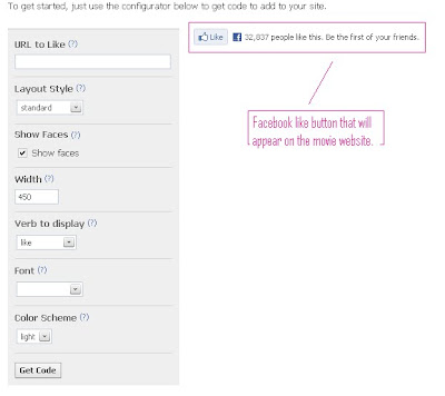
Facebook like button.


Facebook is todays worlds most used social networking site , with millions of active users from around the world. It is used to keep people in touch with one another, and a great feature of facebook is to share links and "groups" to each friend. It also has a feature called a "like" button , which if a user "likes" it will appear on their profile, this will show the link to every person on that persons friends list, so if people like it, it triggers off a chain of "likes". Social networking has been used succesfully in the past to tap into advertising and spreading a movie/brand. Nearly every movie made today has a facebook group / like page. Introducing this facebook like button to our website will help maximize our coverage and give an outreach to people on facebook for absolutely free.
Here is the code that will be implemented on the Schemata site.

Collecting content

As a group we decided that before we even begin to create the website we should collect all the content that will be added to the website e.g. the wallpapers, the icons ( that can be used as Windows messenger display pictures etc.) which will need to be shot and resized. This way when we begin on the construction of the website all the content is ready for use and we wont have to look for/have to make it making this a more structured course of plan.

The pros and cons of Dreamweaver

http://tipsandtricksworld.com/wp-content/uploads/2010/09/dreamweaver-check-broken-links.png
As creating a front page for the website is our ancillary task we had to conduct research into appropriate software as a platform in which to create it. While browsing the internet on website building software we came across various software options for web design such as Web Studio 5.0 , Coffee cup , Adobe Dreamweaver and many more. We decided as a group we would  use Adobe Dreamweaver to create our website because firstly our school offers this currently within it's creative media package (latest version) so no additional charges would incur - and it's advantages over other the other creative software's we have looked at - such as it's wide use with professional web designers , it's wealth of resources available online & it's help and tutorial documents. We also decided to weigh up the pro's and con's of this software package to finalise our decision.

PROS
  • Dreamweaver is a WYSIWYG editor (What you see is what you get)
  • The user interface is easy to understand, and graphical. So functions are easily identifyable.
  • Advanced tools.
  • Drag and drop HTML creator, so complex HTML code doesn't need to be learned.
  • Custom templates can be enabled to change multiple pages in one go.
  • Being an Adobe package it works well in unison with other web packages i.e flash.
  • Dreamweaver coding works perfectly with the latest web browsers.


CONS
  • May look intimidating to new users.
  • Lack of beginner tools.
  • Coding can be messy/complicated if needed to edit other than the drag & drop feature.
  • Entering double style attribute scripts can ruin the web page.
After looking at the pros and cons it is apparent that this software package has indeed a lot to offer in terms of creating a professional web page and it's use of templates to edit multiple pages as well as it's compatibility with all web browsers. However while using the package it is apparent that some HTML knowledge is necessary, the learning curve is steep and taking into consideration the time we must produce this & the main task we have decided not to use this software package to create our web page. Instead we shall seek to find an alternate web designing package which will allow us to produce a page to a professional standard but less time-consuming to learn.

Looking at current website designs


As the group will be creating a website for the trailer we looked at websites of blockbuster movies such as Inception, Saw VI and Devil.

All the sites had links to mass social networking sites such as Twitter, Myspace and a 'like' button for Facebook all of which we will try to incorporate our own.We will also be looking into a 'cool' element in our title similar to Devils.
Other elements we will be looking into for our website will be;
  • Flash animation somewhere on the site
  • A making of video, Television/Commercial trailer
  • Video interview with director, scriptwriter and main actors
  • Gallery (wallpapers, icons, OST?)
  • Crew and cast information
  • Bottom bar with links to social networking sites e.g. Facebook like links

Fonts.

Today we were looking at fonts we could use for the website. Using a standard font for the website wouldn't be professional or appealing to the eye at all. We decided to use an array of fonts which would appeal to the kind look we were going for. We looked over many fonts online to use. Mainly for the banner and main page texts. There were many to choose from , too many for our group to decide so we re-evaluated our approach and decided we need an overall theme for our website. A simple yet sophisticated look is what we decided to go for ,and what we should search for in our fonts. Anything over the top or cheesy would not be used , our approach was decided on the fact that this is indeed a psychological film and so the site should also be replicating that.
The image at the top was one of our mock banners, we saw this as a strong and bold text,simple and symbolic of school life. The fonts we found were mainly on "DaFont.com" it is categorized with thousands of free fonts , which made our search easier.
I will post up images of the chosen fonts in a later post.